Laserklinik
Website and brand for laser hair removal
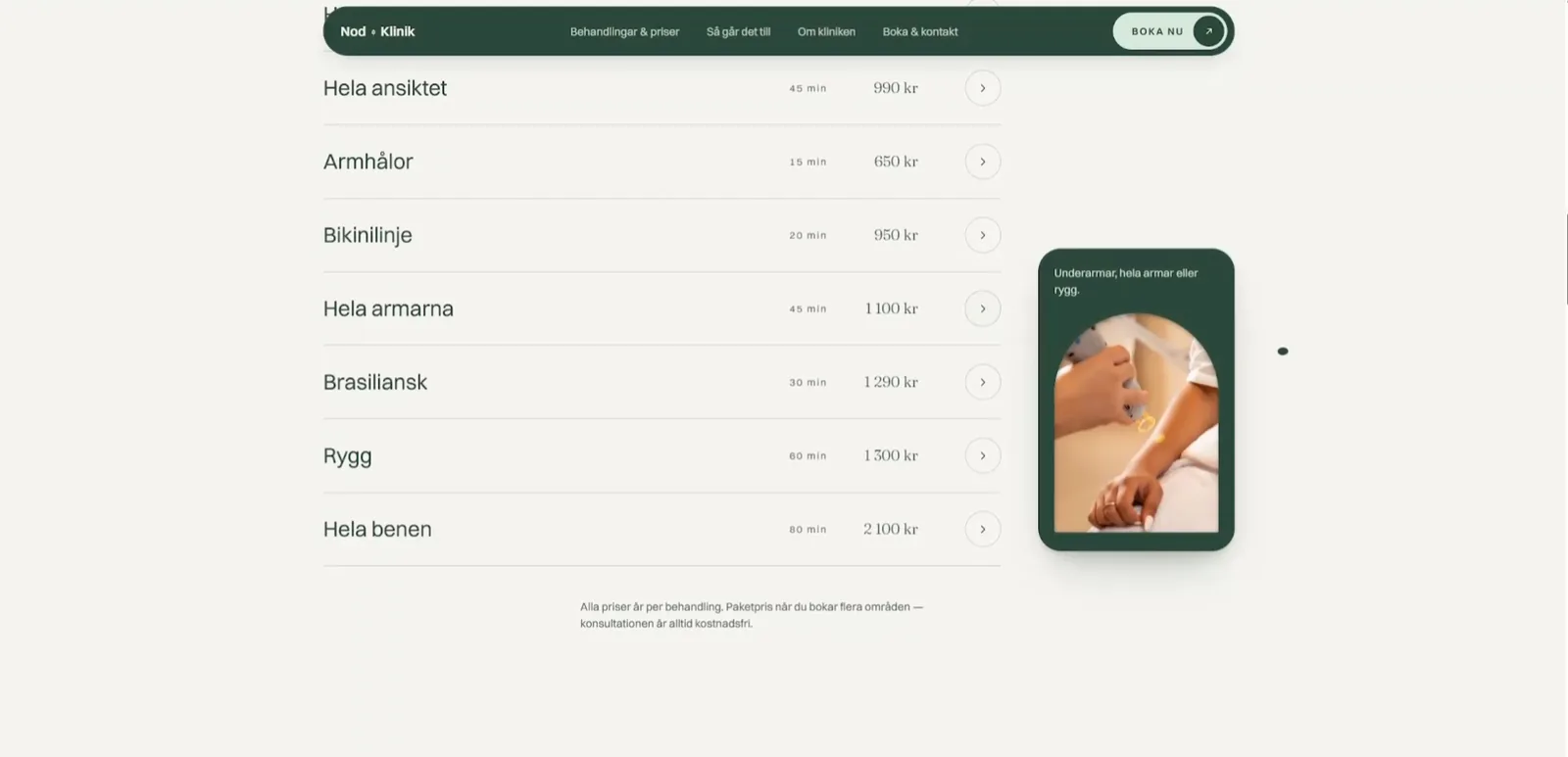
Laserklinik is a website for a clinic specialised in laser hair removal, where every price is in the open, every question gets a straight answer and the first step is fifteen free minutes. It is built around calm, clarity and trust — what decides it when a visitor is booking something that concerns their own body.
The starting point
Clinic websites tend to hide what a visitor wants to know first: what it costs, whether it hurts and whether it works on them. We wanted the opposite — answer everything before anyone has to ask, and make booking a small step rather than a decision.
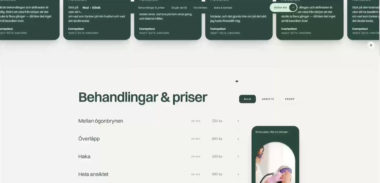
Art direction
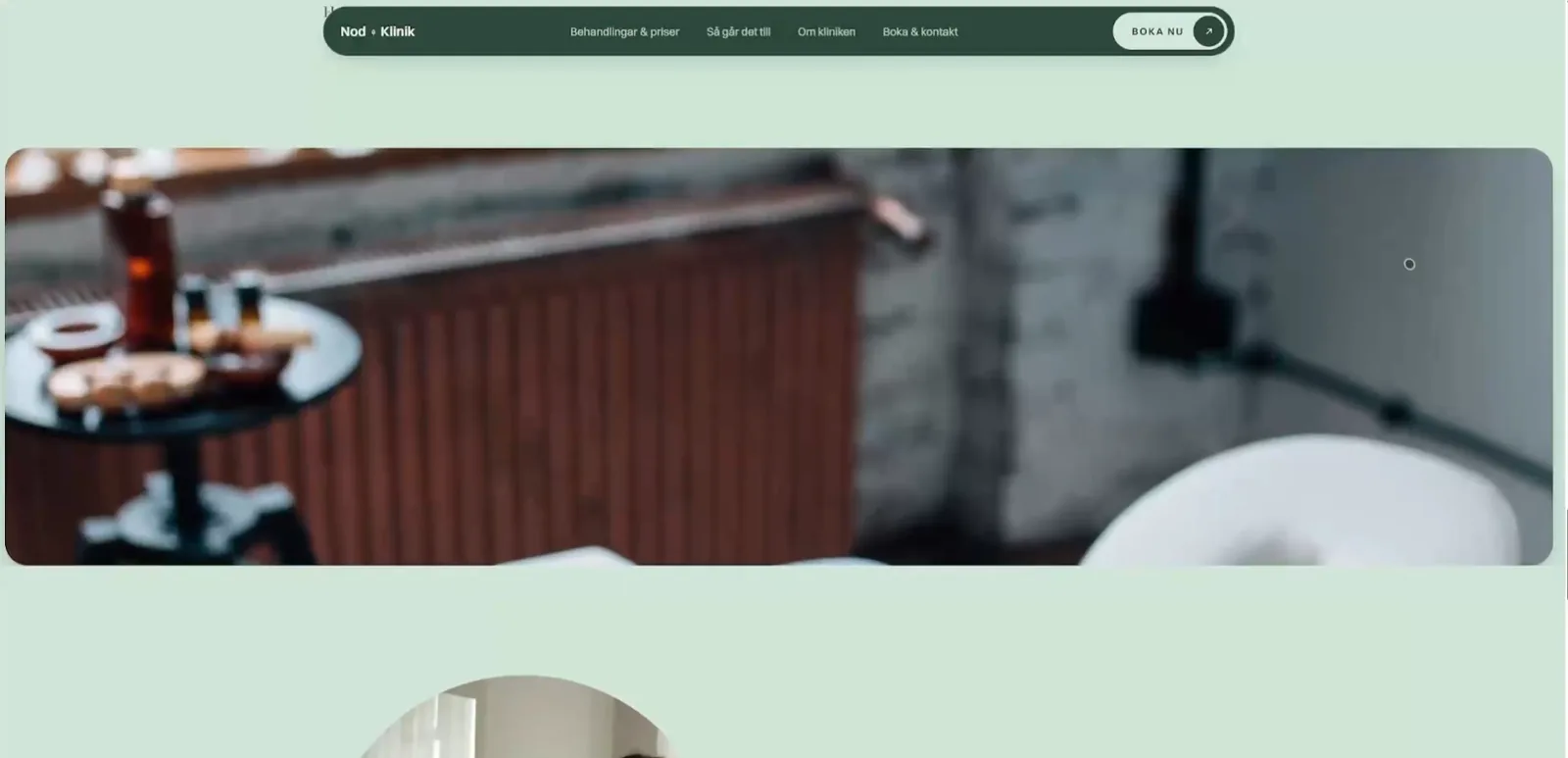
Forest green on mint and cream, a grotesk for the practical and a serif for what should be felt. The images are close and soft rather than clinical — it should feel like a place you want to go to, not a practice you have to.
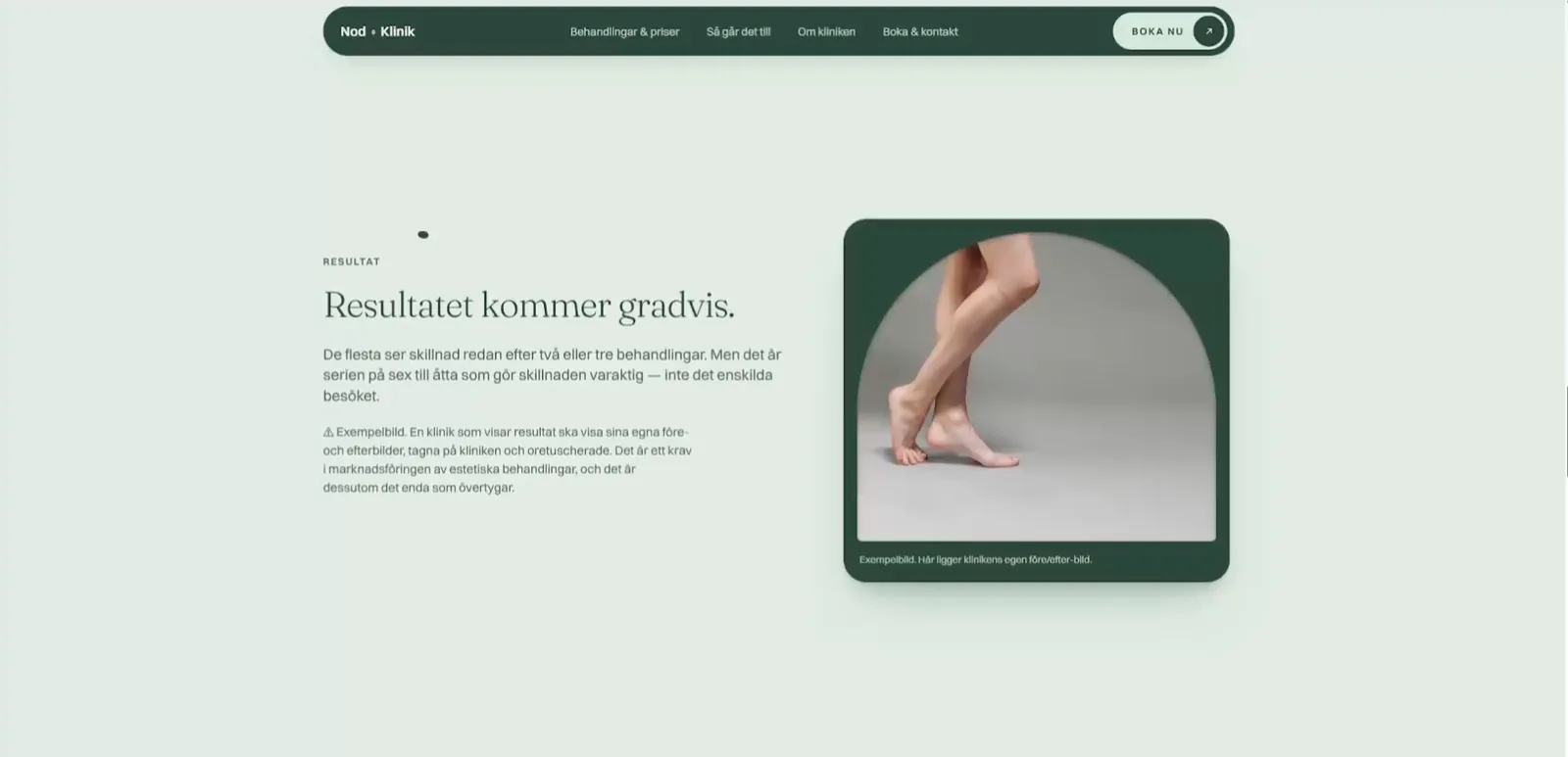
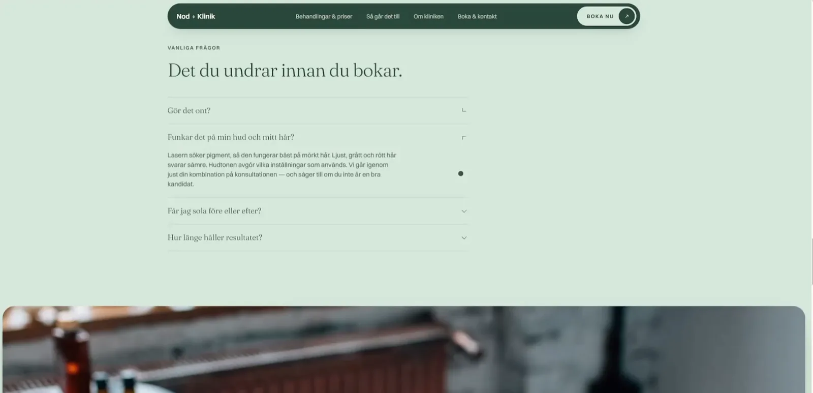
Answer everything before anyone has to ask.
The first step
The whole site leads to one and the same thing: a free fifteen-minute consultation. The button is in the navigation, in the hero and at the end — but it sells no treatment, only a conversation. It is the lowest threshold we could find.
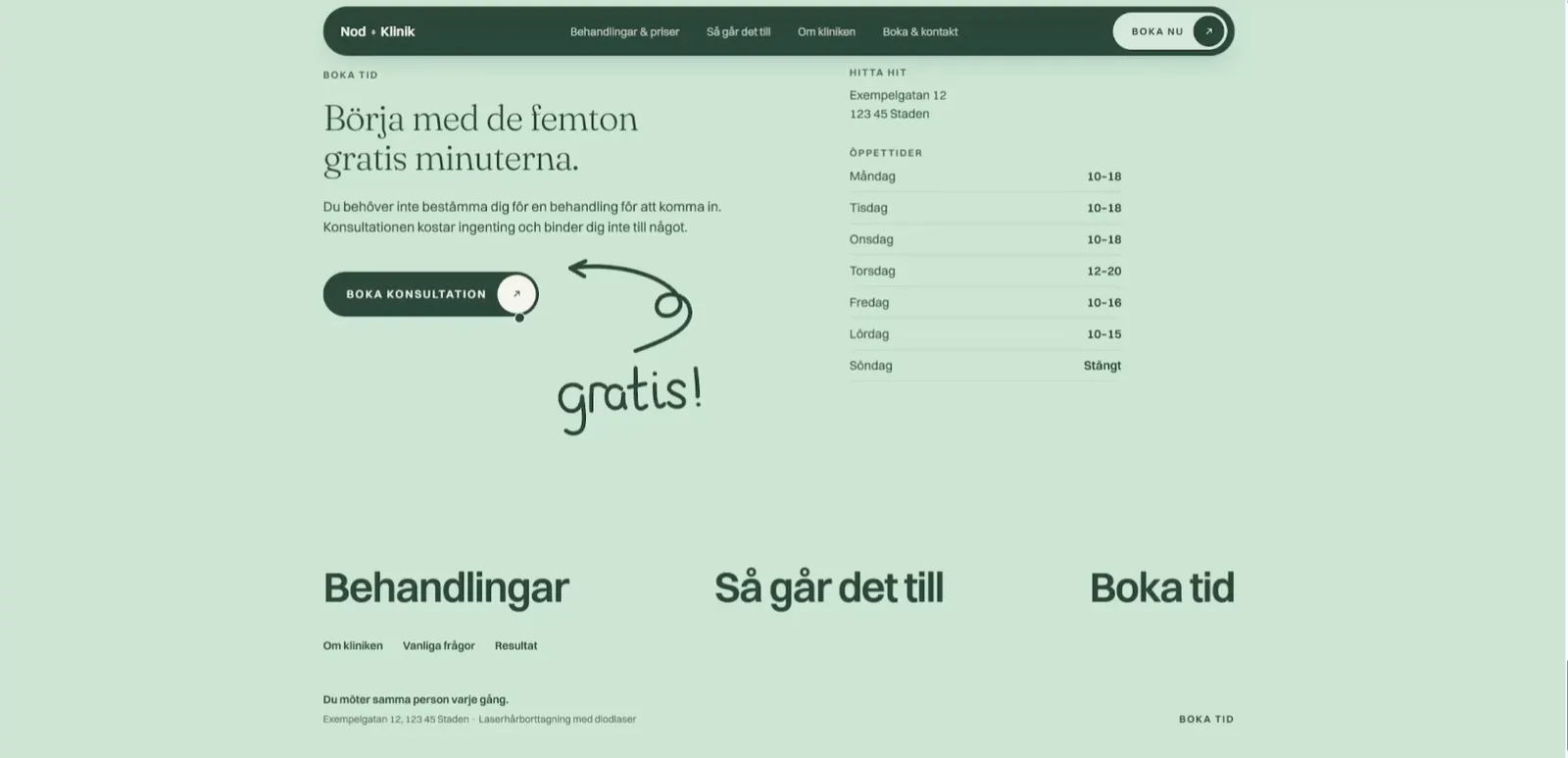
The rhythm
The sections come in the order the questions usually come: what does it cost, how does it work, what will the result be, what else do I wonder — and then the booking. Every section is short and does one thing, so the page feels calm even though it answers a lot.
Where it stands
Laserklinik is our own craft and shows how we build for aesthetic clinics, one of the industries we aim at. What we are happiest with is that the site is calm and direct at the same time: the prices are in the open, and yet it never feels like a price list.
- Design & art directionNod Marketing
- BrandNod Marketing
- DevelopmentNod Marketing