Reach Higher
Editorial travel & adventure site
Reach Higher is a concept site built in-house: an editorial travel and adventure magazine where the image takes the room and the text stays short. It exists to show how we think about pace, typography and motion when the content is the photograph.
The starting point
Travel sites tend to drown in their own imagery. Everything is big, everything moves, and when it all shouts at the same volume the visitor stops hearing any of it. We wanted the opposite: let one image carry at a time, and let typography set the rhythm between them.
Art direction
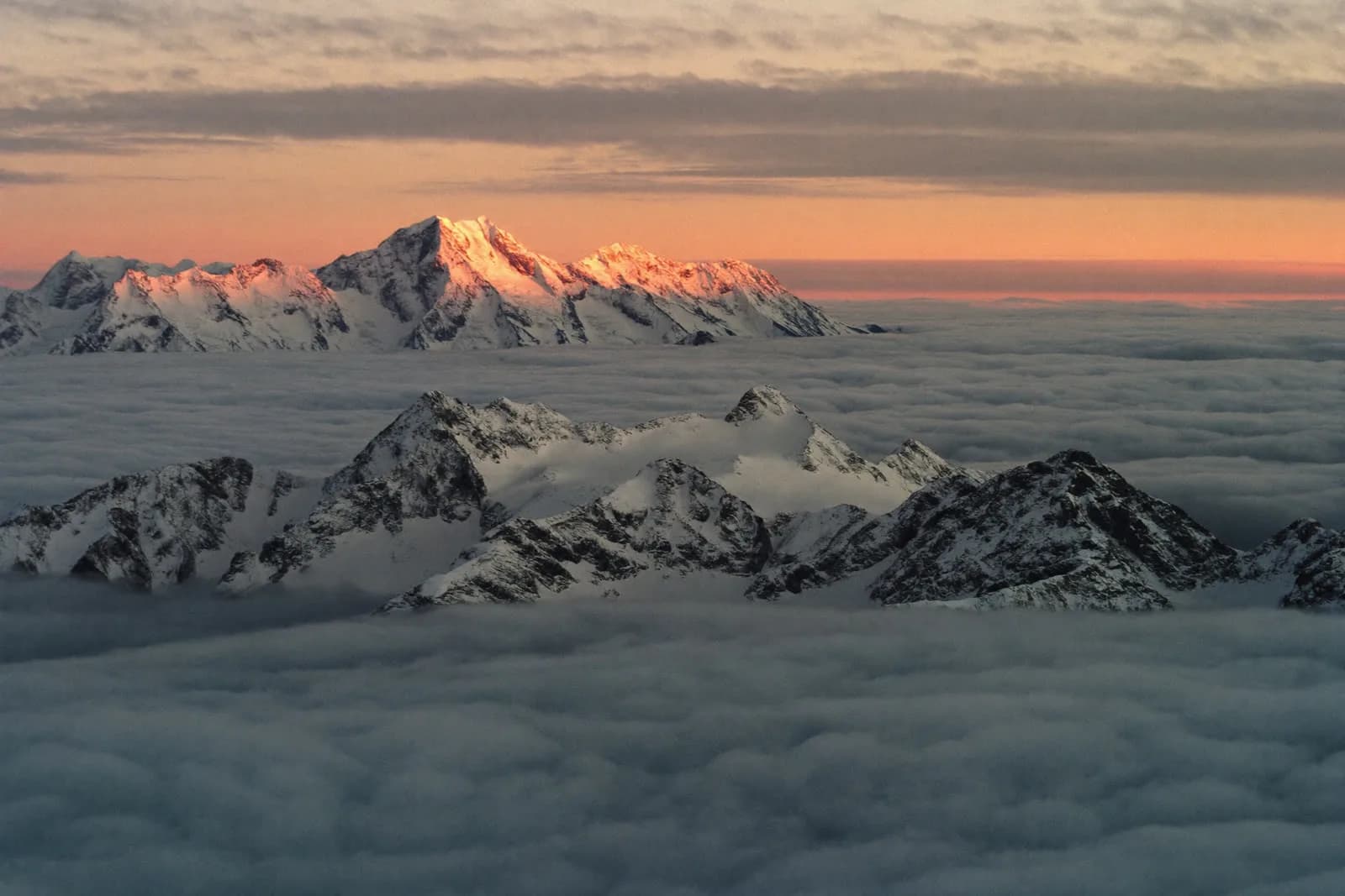
A warm, cinematic grade holds together images from four continents that would otherwise have nothing in common. Headlines are set large and tight, body copy small and airy — the contrast between them is what gives the page its pace.
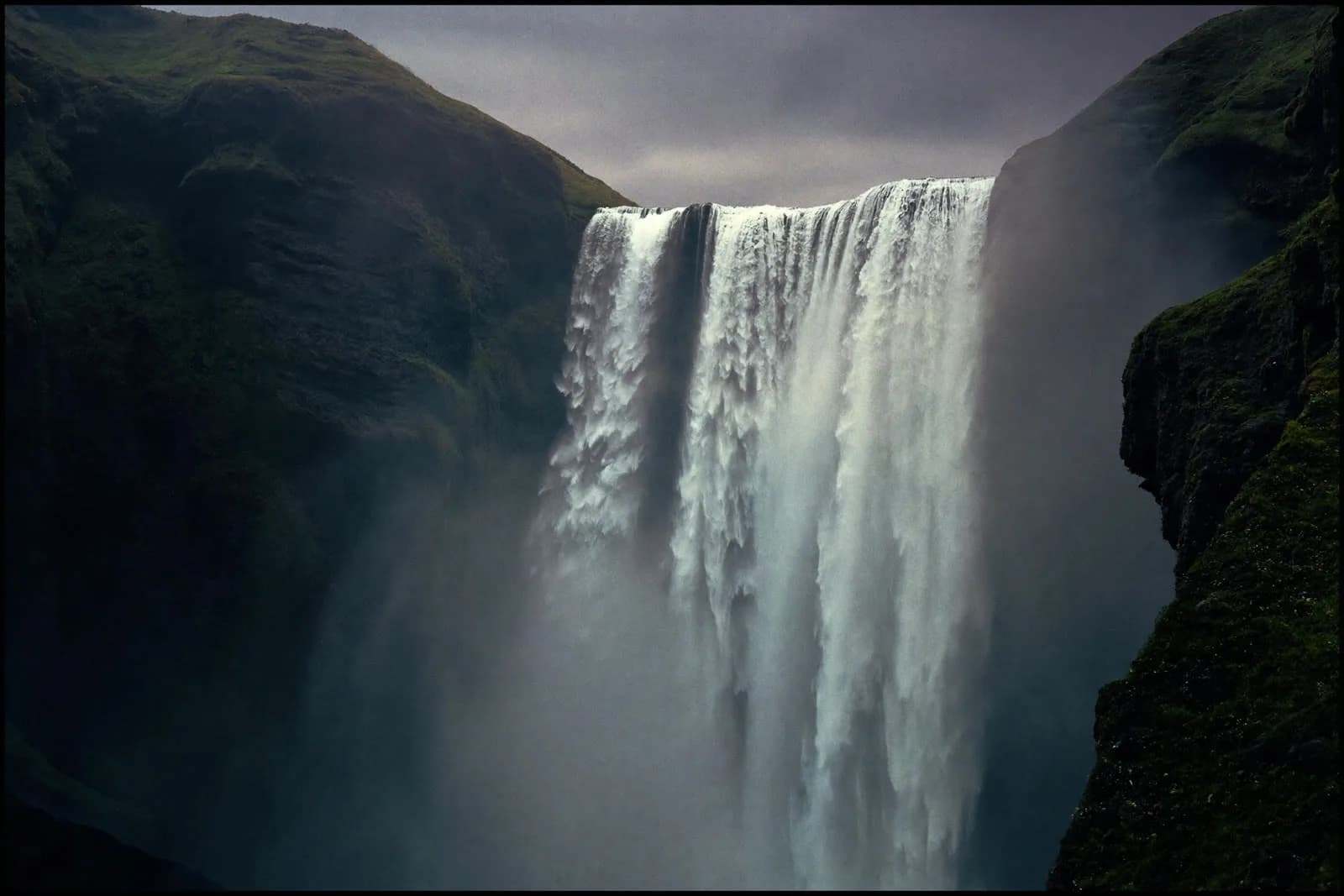
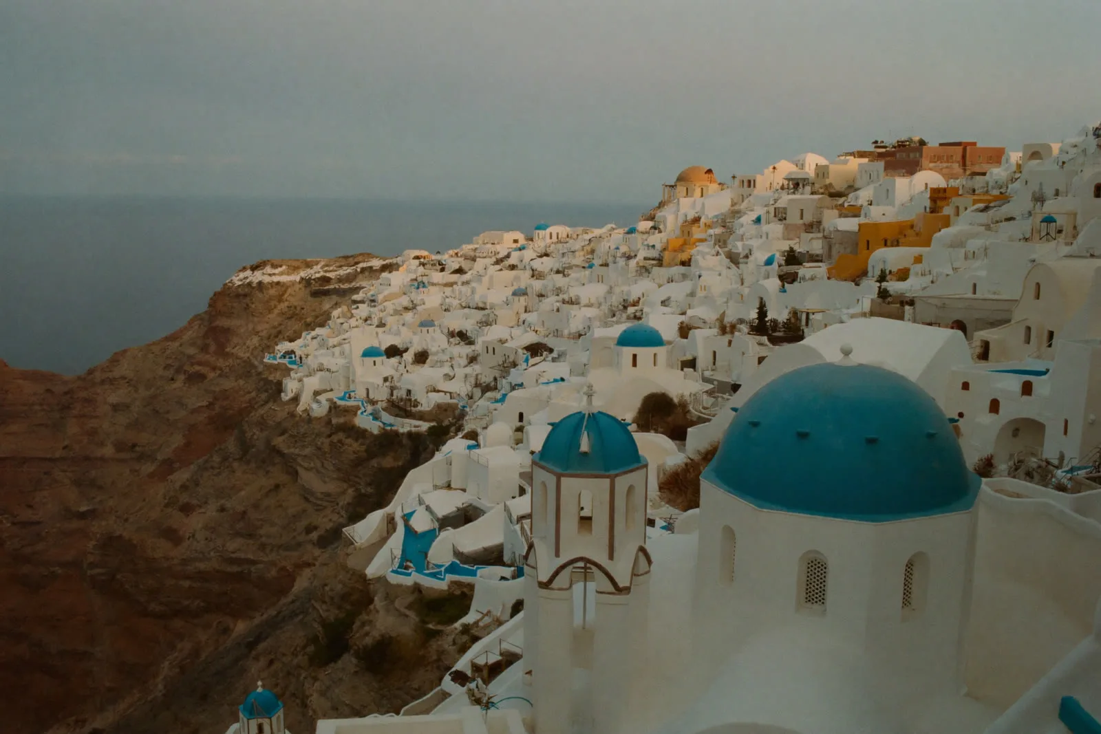
One image at a time. Typography does the rest.
Motion
Motion is sparse and follows the scroll rather than playing on its own. Images scale slowly, headlines rise in line by line. It should feel like leafing through a magazine, not like being shown a presentation.
The build
The site is built in plain HTML, CSS and JavaScript, with GSAP for the chapter transitions and Lenis for smooth scrolling. One swipe or scroll step is one chapter, and images don't load until they approach the screen.
Where it stands
Reach Higher is our own craft, not a client engagement — it exists to show the level, not to sell trips. The part we are proudest of is that the site feels calm despite being made almost entirely of large photographs.
- Design & art directionNod Marketing
- MotionNod Marketing
- DevelopmentNod Marketing